Santa Cruz Website Redesign
2023
Role: UX Designer
Overview:
A government website redesign focusing on heuristic evaluation to identify potential usability challenges and propose solutions for users during the sign-up process for water services.

Design Process
User Research
Problem/ Solution
Proto Persona
Storyboard
Problem Definition
User Task Flow
User Flow Diagram
Heuristic Analysis
Prototyping
Lo-Fidelity
Mid-Fidelity
UI Style Guide
High-Fidelity
Design Principles:
-
User-Centered Approach: The redesign process focuses on understanding the needs and pain points of the target user, Eren, a business consultant new to the area, to ensure a seamless and intuitive user experience.
-
Streamlining User Journey: The goal is to enhance the user journey, connect disjointed pages, and reduce visual overload, leading to a more cohesive and efficient experience for users.
-
Minimalistic & Aesthetic Design: The redesign emphasizes a clean and modern aesthetic, with attention to consistent layouts, color schemes, and information formatting to improve readability and visual appeal.
-
Prioritization and Simplification: Multiple navigation bars and redundant options are condensed, and categories are prioritized to guide users efficiently through the website and reduce unnecessary complexity.
-
Consistency & Standards: The redesign focuses on maintaining consistency across the site and adhering to industry standards to create a more familiar and user-friendly experience.
Design Constraints:
-
Usability Challenges: The redesign process centers on identifying potential usability challenges during the sign-up process for water services on the Santa Cruz government website.
-
User Flow Analysis: The approach relies on user flow analysis to identify key heuristics and derive actionable solutions, with the aim of improving the overall user experience.
-
Focus on Water Services Sign-Up: The redesign is specifically targeted at addressing usability issues related to users signing up for water services, ensuring a smooth and efficient registration process.
Overall, the Junior UX Designer uses a combination of design principles and constraints to create a more user-centric and visually appealing experience, addressing pain points and enhancing usability for users like Eren.
Problem
I want to gain insights into the user experience and registration process for water services on the Santa Cruz government website, aiming to uncover valuable insights and potential areas for improvement."
Solution
Using user flow analysis to identify key heuristics and derive actionable solutions for improving the user experience.
Hello
Meet Eren, 27
Goals & Needs
Eren's priority is to settle into moving to her new place her first task she decides is to complete her need to set up her resident utilities.
She wants to organize and design her new place with a modern clean aesthetic.
Pain Points/ Potential Solutions
Eren hates complicated and outdated websites.
New to the area she's reliant on websites to complete a majority of her tasks.
She doesn't like to waste time on complicated procedures for simple tasks.
About
Eren is Business Consultant that recently moved to the Bay Area. She works in a hybrid setting and chose Santa Cruz because she loves beaches and found this location a reasonable distance from her company. She loves to go to the beach to surf and relax while reading true crime novels. She loves nature and wants to explore Santa Cruz's hiking trails.

Storyboard

User Centered Problem Statement
Our top priority is to identify and address usability issues specifically related to users who are looking to sign up for water services on the Santa Cruz government website. By enhancing and streamlining the user journey, we will connect disjointed and visually overwhelming webpages, ensuring a more cohesive and intuitive experience. Our ultimate goal is to provide these users with the necessary information in a seamless manner, guiding them effortlessly through the interface. We are committed to keeping users well-informed and empowering them with easy access to additional information, enabling them to find the resources they need with ease.
User Task Flow to Setting up Water Utilities
Enter Homepage
Hover over Services
Select Utilities
Taken to Utilities Page
Select Start Service
Tab Pop-up of Water-Refuse-Sewer Service Page
Select Single Family Residential Form
Complete Form
Submit Form
User Flow Diagram

Heuristic Evalution

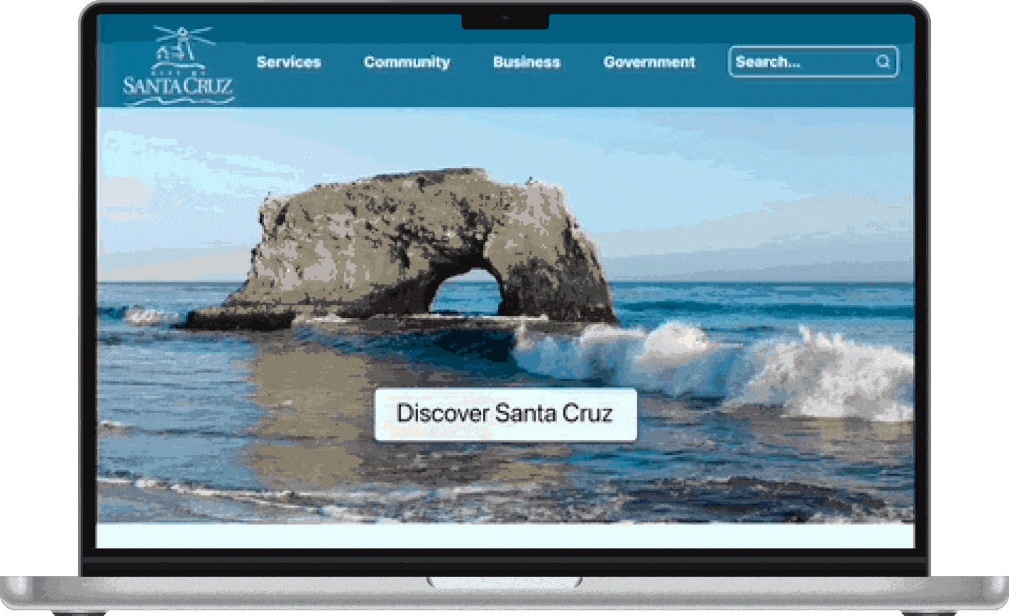
Homepage

ISSUE:
Multiple navigation bars
Multiple options for users to complete the same task
SOLUTION:
Condensed multiple navigation bars
Prioritize Categories for Users to choose from in order for users’s clarity and confidence in completing their task.
Combined News + Meetings & Events to one Section in Homepage with Calender view
Deleted Search Bar in front page and Replaced with a "Discover Santa Cru" Button
Deleted "How Do I Section" on Navigation Bar and Replaced with "I Want To.." tool on Homepage

Utility Page

Issue:
Multiple navigation bars
Multiple options for users to complete the same task
SOLUTION:
Condensed multiple navigation bars
Prioritize Categories for Users to choose from in order for users’s clarity and confidence in completing their task.
Combined News + Meetings & Events to one Section in Homepage with Calender view
Deleted Search Bar in front page and Replaced with a "Discover Santa Cru" Button
Deleted "How Do I Section" on Navigation Bar and Replaced with "I Want To.." tool on Homepage

Service Page

ISSUE:
Minimalistic & Aesthetic Design:
Layout of picture does not seem consistent to page.
Yellow highlighted cell.
Help and Documentation
Formatting of Information with Table and separate cells are confusing to users.
Aesthetic and Minimalistic
SOLUTION:
Create Drop Down Menu for Inside and Outside City Forms
Create buttons for other services
Included "Terminating Utility Service" prominent without highlight
Placed picture on top rather on the side floating


Form Page
ISSUE:
Consistency & Standards
No direct back button to pervious page of forms
One column throughout with one line having 2 columns.
Aesthetic and Minimalistic Design
Some aesterics add an aditional line
Match between Real World
Edited words which may seem confusing for users.
SOLUTION:
Create 2 Column rather One to eliminate white space and utilize whole page
Define Cart Refuse Size